Text is everywhere on the web. Whether you're building a landing page or writing a blog, clean typography makes everything easier to read. You don’t need fancy fonts or design skills; just a few basics to get it right.
Four key variables
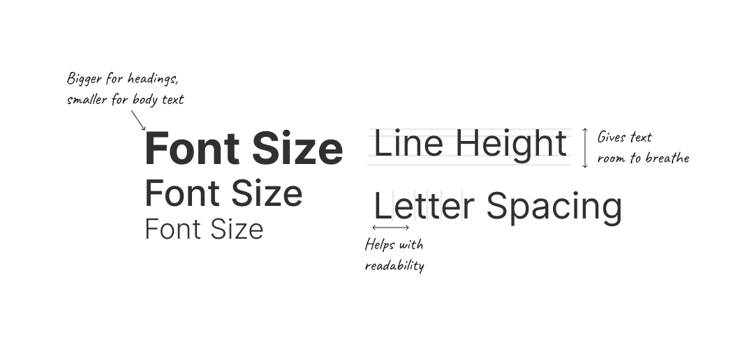
Good typography usually comes down to four simple things:
- Font size – Bigger for headings, smaller for body text. Use size to create structure.
- Font weight – Bold for emphasis, lighter for secondary content. Most fonts range from 100 to 900.
- Line height – Gives text room to breathe. Too tight feels cramped, too loose feels disconnected.
- Letter spacing – Helps with clarity, especially in headings or small text.
A good default body text uses 16px font with 1.5 line height.
Here’s a simple rule: large and bold text works best with tighter spacing, while smaller or lighter text needs more line height and letter spacing. Balancing these keeps text readable and visually organized.
Picking fonts
Fonts set the tone for your site. Stick to one or two and use them well.
- Serif fonts have small strokes at the ends of letters. They feel classic and are great for headlines or article content.
- Sans-serif fonts are clean and modern. They're easy to read and work well almost anywhere.
- Monospace fonts align each character evenly. Use them for code blocks or subtle visual accents.
For most projects, one clean sans-serif font like Inter, Raleway, or Source Sans Pro is more than enough. If you're unsure how to scale your type, tools like Typescale are useful for setting up headings and body sizes.
Font pairing
Font pairing can be used to add visual interest. Typically, a serif font is used for headings and a sans-serif for body text. This creates contrast while maintaining readability. It’s important to ensure the fonts complement each other in tone and style.